What is a CTA in Email Signature?
A CTA (call to action) asks customers to take a specific action. Typically, those requesting the action want to make a sale or grow their email subscriber list.
CTAs come in many forms, but find the most success when addressing a problem the reader has. Either way, the easiest way to get started is through an email signature generator.
Creating a CTA Email Signature in HubSpot
HubSpot has an amazing email signature call to action creation tool. The signature is simple and provides you with everything you need to get started with an engaging CTA.
To start, HubSpot asks you to select one of six templates. Next, you’ll want to enter your basic signature details:
- Name
- Job title
- Department
- Phone number (s)
- URL
- Address
- Social links
- Any custom field
You should also take the time to select colors and profile picture. However, our focus is on the last tab: creating a custom CTA.
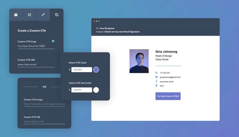
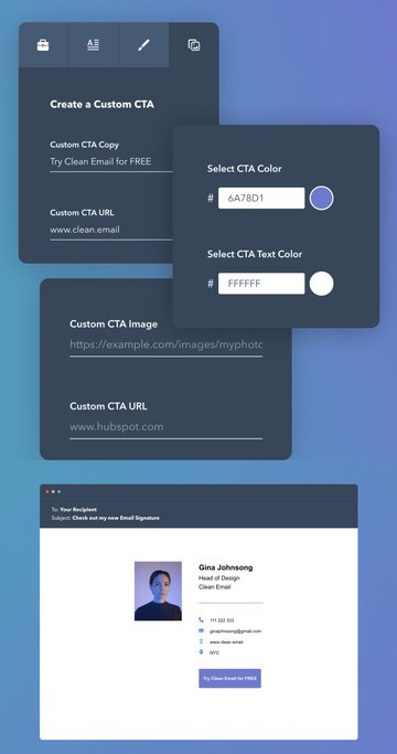
The custom CTA section (found in the upper-right tab on the left-hand navigation bar) allows you to select the specific copy, the URL, and the text color. Alternatively, you can choose to put in a custom image (such as a banner).
The basic link option automatically converts your text into a button. You’ll want the button color to stand out, so pick a striking color.


Alternatively, picking an image allows you to give customers a preview of what to expect. For example, you might include a link to your latest YouTube video. The image provides a preview of what that video will look like.
Five Tips for Creating an Efficient CTA Email Signature
Creating a CTA in your email signature differs from doing so for a blog post. Knowing this, here are five tips you can use to make your emails stand out:
Keep your signature professional
Regardless of the CTA you choose, it is important to maintain a professional email signature. Signatures that look unprofessional do not instill confidence in your reader.
For example, if you saw a misspelling in a signature, what perception would you have? Likely, it would make you think that the company lacks attention to detail.
So, regardless of the CTA, be sure everything around it works. Consistent branding, colors, high-quality images, and links to professional social media pages are all basic parts of your signature.
Don’t skimp on the quality of something that your email list will see.
Have a specific aim in mind
Great calls to action have specific goals. These goals can be anything from growing an email list, increasing sales, or getting people to engage with something you wrote.
Regardless of what your aim is, your CTA needs to meet specific goals aligned with your business.
Specific, instruction-driven CTAs provide the reader with steps on what to do. Nine times out of ten, letting a customer loose on your website with no direction will cause them to leave.
However, if an email client sees a specific set of steps that will bring them closer to what they want, that changes things.
Specific objectives also work better for businesses. After all, it’s a lot easier to measure "an increase of sales by 10%" as a useful metric. Less specific metrics (like more website visitors) aren’t as helpful.
Make your CTA person centric
Think about your customer and their priorities before creating any CTAs. How will your CTA appeal to the customer? If you can’t answer that question clearly, you might have to try again.
CTAs are most effective when they address a customer’s problem. Ideally, a CTA should change depending on who you target.
For example, if you target people who buy your products, a discount makes sense. Current customers with proven loyalty like to save money.
However, that same CTA to someone who doesn’t know your products wouldn’t help. A "learn more" CTA offering early stage customers an opportunity to understand your product can help.
You can also change your CTA for non-customers. For example, if you are hiring, you would want this information to be there when communicating with fellow industry experts.
Perform A/B testing of different signatures
If you pay for advertising on Google, you wouldn't stick with an advertisement that doesn’t get results. But to figure that out, you’ve got to perform some A/B testing, something not exclusive to advertising.
A/B testing involves you tweaking a single element of something to see how results change. Ideally, the changes you make move you closer to your business objectives.
A/B testing of different email signatures can involve changing the image, the CTA text, or the button color. You’ll want to limit your change to a single thing when running these tests.
You might wonder why you wouldn’t change multiple things. However, this makes tracking the results of your change impossible. So changing a single thing gives you more information.
Eventually, you’ll have an optimized email signature built to get the most out of your target audience. Without A/B testing, you won’t be able to find that information.
Make the customer journey clear
Whether you are sending business emails or customer support, the reader doesn’t like to waste time. Knowing where things are leading allows you to plan accordingly. Surprise is not your customer’s friend.
CTA button text is one opportunity to do this, clearly leading customers to a specific aim. However, if the text isn’t clear where the button will take them, you lose out on trust.
For example, if you click "learn more" and go to a page that prominently displays discounts, you aren’t learning. Instead, you feel pressured into making a sale, something the CTA didn’t account for.
Make sure the customer knows what’s going on within second after clicking the CTA. If it’s a "buy now" button, don’t hide the sales page behind a wall of text. If it’s a "learn more" button, don’t start with the sale. Make your CTAs incredibly clear.
Other Handy Email Tools - Clean Email
Now that you have a good idea of how to create CTA email signatures, you can master your inbox. Given the mass amount of clutter you get every day, you want to focus on emails from your clients and customers.


Using Clean Email, you can focus more on the emails that matter. Clean Email is free to try and comes with many useful tools that address everything from unwanted subscriptions to annoying senders. Automate your inbox cleaning experience by using Clean Email today!
CTA email signature FAQs
Can I create an email signature with CTA using another sig generator?
Beyond HubSpot’s generator, there are many free email signature generators available. Try out a few to see which one offers the best features.
How to make the CTA image in HubSpot clickable?
Underneath the image upload area, there is a specific image URL. When you put in the URL, the image will automatically become clickable.


